Heuristic evaluation and redesign of a transportation app
A study of the Massachusetts Bay Transportation Authority Commuter Rail mobile application

The MBTA Commuter Rail application has a few primary tasks that should enable riders to utilize the commuter rail system
The MBTACR app lets commuting users easily determine their train times to and from Boston. It also allows for the saving of specific train times, notifications to be enabled for specific trains, reports on the status of trains currently en route, and provides a method of communication between the user and the MBTA.
Being a regular user of the MBTACR app I already knew I wanted to redesign this app. A prior year of relying upon it taught me that it was ineffective at performing its core function: helping riders find out information about their train quickly and with ease.
Tools used
- InVision Studio
- InVision (prototype)
Process summary
- Created a persona based on qualitative research
- Identified key tasks vital to the app
- Developed scenarios for the persona based on the most important tasks
- Identified the issues by leveraging the scenario to walk my participants through the application
- Redesigned the application, focusing on these issues as a way to track improvement
My role
For this project, I was the team lead, and facilitated the exercise as well as designed the prototype.
Due to extenuating circumstances my class was only 2 students (myself included) and a professor. We acknowledge that to do this evaluation most effectively we would have needed 5 people participate, as per Nielsen’s guidelines.
Persona
I created the persona based on people I met on the commuter rail who live in the greater Boston area but don’t often go into the city.
The persona, Maggie Jones, is a real estate lawyer working out of her office by South Station in Boston. She was made to fit many of the app’s users: a working professional living in the greater Boston area, working at a satellite office but often has to travel into the city for meetings, and only is familiar with parts of the city but needs help navigating around from her phone and the apps on it (like Google Maps).
Maggie Jones, MBTACR persona
- Gender: Female
- Age: 37
- Occupation: Real estate lawyer
- Income: $157k
- Mobile usage: Near constant, to keep in touch with family, maintain client relationships, and get around.
- Hobbies: Weekend book club, her children’s sports and theater events, local historical society
- Motivation: To not waste time, as she has to spread herself thin to do everything she has to do and wants to do!
Scenarios
I wanted to find the pain points that users would encounter on their way to completing the primary tasks on the app.
By using two scenarios that I identified, we walked through the application and pointed out each instance where we thought there was a heuristics violation.
Scenario 1:
It is 8:28 PM and Maggie has had a long day at the Boston office, in and out of meetings with her colleagues from all around the greater Boston area. She knows she needs to catch a train back out to Framingham, but she cannot remember when the train is. The last time she tried to take a train she arrived too early, and she had to stand on the platform in her heels and suit. It was uncomfortable and she wasted too much time in the process, as she could have stayed in the office and wrote a few emails instead. In order for her to get home, she needs to figure out the schedule of trains leaving South Station. To do so, she opens the MBTACR app on her iPhone that was recommended by a coworker and taps through the first screen, then inputs her starting point, destination, and date. Now she knows the next train is at 8:35pm and can pack up her things to leave in time.
Scenario 2:
Once she is seated onto her train and paid her fare, Maggie wants to add her morning ride to her home screen on the app. She knows that if she had not gotten lucky and checked the app in time, she probably would not have made it to her train on schedule, and she does not want to take that chance tomorrow with the distractions that her family provides. If she could get notifications as to the arrival of the train and if there are any delays caused by weather (or malfunctions) she would be better prepared for leaving the house on time. To do so, she goes to manage her rides and turns on push notifications. Now, she has confidence that she will definitely be on time for her train tomorrow morning.
Heuristics and rankings
The basis for discovering issues were predicated on our understanding of Nielsen’s heuristics, a framework used to identify strengths and weaknesses within interaction designs.
Summarized and paraphrased, they boil down to:
- Users should know what’s going on because of feedback from the system
- Users should be familiar with the phrasing, terminology, and concepts presented
- Users should have the freedom and control to exit a task as wanted
- Users should feel comfortable because phrasing, terminology, concepts and task flows stay consistent
- Users should avoid errors due to effective error prevention
- Users should easily move through a task flow by making things visible and not making them remember too much
- Users should have the ability to adjust the way they use the service as they grow
- Users should not be distracted by the visual design of the product
- Users should be able to understand what errors they get, why they get them, and how to fix them
- Users should know where they can get help if they need it
In addition to the heuristics, we evaluated the severity of the issues found via Sauro’s hierarchies as listed in a blog post online.
1. Minor: Causes some hesitation or slight irritation.
2. Moderate: Causes occasional task failure for some users; causes delays and moderate irritation.
3. Critical: Leads to task failure. Causes user extreme irritation.
Results
Altogether, we found
- 5 minor issues
- 8 moderate issues
- 4 critical issues
Positive findings
H1 Visibility of system status
- The first screen loaded with a pop up that told users they need to update. This alerted them to the fact that their app was outdated, and ran the update for them when prompted.
- The bottom of the notification settings for an individual train ride tells users that once those settings are modified, it could take up to 15 minutes to see the changes take effect.
H5 Error prevention
- When choosing to turn on notifications for a train ride, the app asks the user to confirm they want to turn notifications on, therefore preventing users from accidentally turning them on.
- Taking one step further, just in case the user accidentally makes it through that last pop up about notifications, when taken to the push notification preferences all of the notifications are automatically set to off, making it very difficult for a user to accidentally turn on unwanted notifications.
H7 Flexibility and efficiency of use
- When selecting a starting point or destination, it allows the user to start typing a location or browse for one from a drop down list, making it easier to recognize rather than recall information (therefore, it speaks to H6 Recognition rather than recall as well)
H8 Aesthetic and minimalist design
- Overall, the app maintains a very minimal, clean aesthetic. It is pleasing to look at and is branded with the MBTA color for the commuter rail, purple.
Negative findings
In this MBTACR app there were quite a few places within these two tasks that strayed from Nielsen’s heuristics. These are reported in detail below, listed in order of the heuristic that was violated. For each instance listed will be which task it was discovered from, what the issue is and its severity, and the recommendation for making the design better. Additionally, there are screenshots taken by the author.
H1 Visibility of system status. The system should always keep users informed about what is going on, through appropriate feedback within reasonable time.
1.1 Look up train time
Moderate issue: Users might expect to see the status of the trains currently running, such as delays. To have no feedback of that kind could cause some users to show up for their train, only to find it is delayed. This is inefficient and frustrating.
Improvement: Add an icon of an exclamation point inside a circle next to the train number (called “trip” here) to indicate when a train is delayed or has other issues/notifications. Allowing users to drill in further to learn about the issue would help them prepare better for their trip.
H2 Match between system and the real world. The system should speak the users' language, with words, phrases and concepts familiar to the user, rather than system-oriented terms. Follow real-world conventions, making information appear in a natural and logical order.
2.1 Look up train time
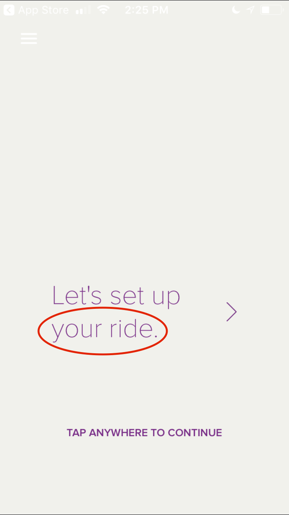
Moderate issue: Using the term “your ride” is the type of language that users would expect to see from Uber or Lyft, not from public transportation. It denotes a level of privacy that is not found on public transportation, and therefore might mislead users as to what the purpose of this app is.
Improvement: Use better phrasing, such as “Find your train” would better indicate what the purpose of this app is and why users would want to use it.
2.2 Look up train time
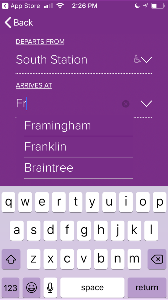
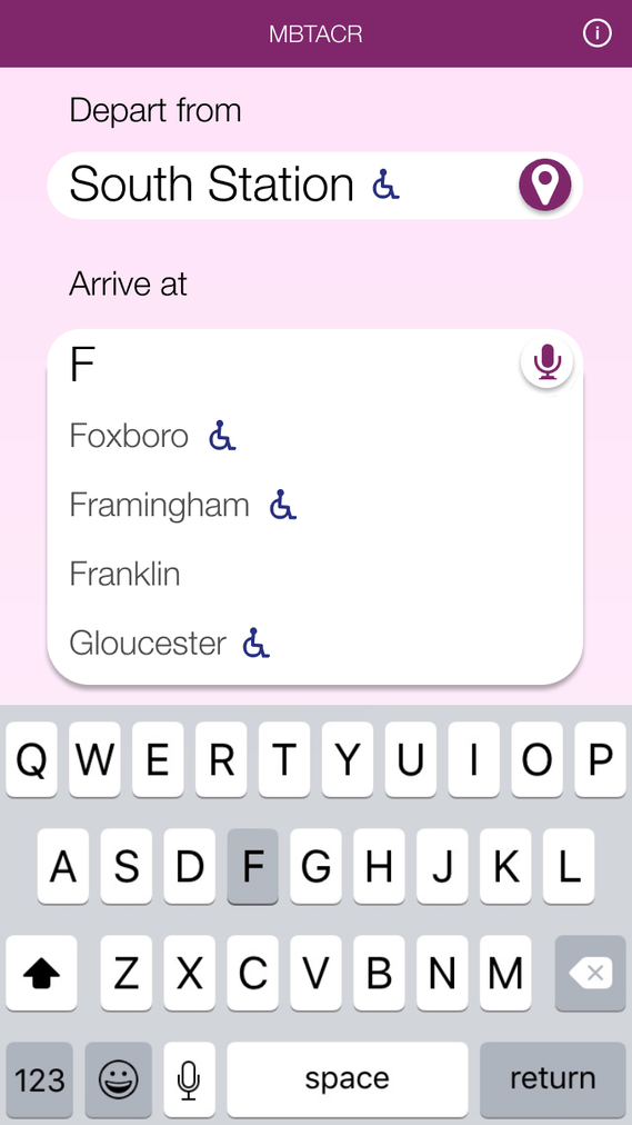
Minor issue: Not showing the location options in alphabetical order is confusing, and defies the logical order users expect to see. Users can still locate their location through typing, but the listed order is disorienting.
Improvement: Listing the options in the order the users expect to see them, alphabetically, or letting them toggle between stations closest to them and alphabetically, would help users find the location they are looking for.
2.3 Look up train time
Moderate issue: Having the first train that appears be the first train that leaves in the morning, versus the train that is closest to the current time, could cause major confusion for some users. This is made worse by the fact that the first trains listed occur around the same times that users want to catch trains home; after a long day of work, they might miss that it says AM rather than PM and head to the train station at the wrong time.
Improvement: Map the train schedule to the current time. List it in order nearest train that has not left the station yet.
2.4 Look up train time
Minor issue: Using the terminology “riders” doesn’t properly indicate the volume of people that are typically on the train.
Improvement: Using a word like “Popularity” would help users understand the icon as a reflection of scale of the number of riders on the train.
2.5 Modify notifications of saved trains
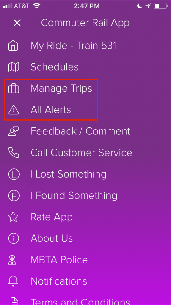
Moderate issue: “Manage trips” with a suitcase icon does not communicate to users that it is a way to add and modify a list of frequently used trains. “All Alerts” does not tell the user what the alerts are for, and they might anticipate that if there was an alert they would get a notification about it or the icon next to it would be a different color, like filled in with yellow. Because these options are miscommunicated, users are less likely to use them.
Improvement: Using terms such as “Modify saved trains” and “View commuter rail alerts” would better communicate to users the intent of these menu items.
2.6 Modify notifications of saved trains
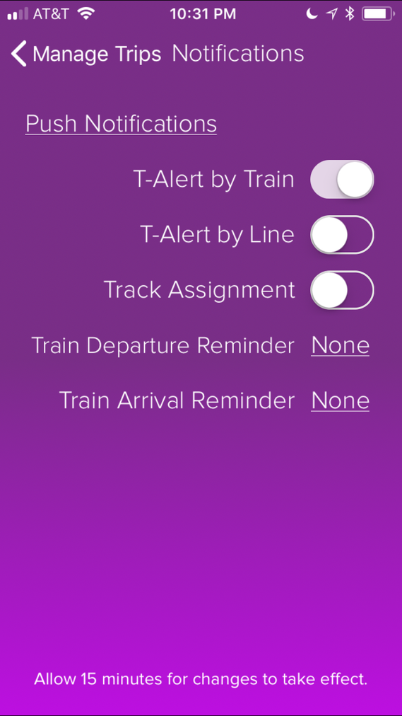
Moderate issue: “T-Alert” does not mean anything to users. It may eventually sink in that “by train” indicates notifications about a specific train time, and “by line” means general notifications about a specific train line (such as the Worcester line, or the Providence line, etc), but if it does not then the user is unclear as to what this means and may not utilize this feature.
Improvement: “Notify me about this train” and “Notify me about this train line” would do a better job of communicating to users what this does.
H4 Consistency and standards. Users should not have to wonder whether different words, situations, or actions mean the same thing. Follow platform conventions.
4.1 Look up train time
Minor issue: The contrast is not standard, so there isn’t enough of a difference between the white and the light grey human figures, or the light grey figures and the light purple background. Users may not be able to determine the popularity of that train time while the train time is selected, or if the train time happens to be one with a purple background.
Improvement: Apply a dark purple stroke to the selected train time rather than applying a dark purple background.
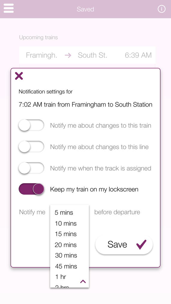
4.2 Modify notifications of saved trains
Moderate issue: As seen in the screenshot, the buttons for modifying the notification settings of the saved train and deleting the train are too close together. This defies design standards that specify the sizing and spacing of buttons on mobile devices to prevent people from accidentally tapping on buttons.
Improvement: Make the buttons a little bit bigger to make them more accessible, and space them further apart from one another.
4.3 Modify notifications of saved trains
Minor issue: The text treatment of the link and the heading are the same, so users might not realize they can click on “none” to modify its settings. Web design standards suggest that links should be visually treated differently than other text so that users know when they can click on items and when they cannot.
Improvement: Put a box around “None” to indicate it is a button that can be pressed.
H5 Error prevention. Even better than good error messages is a careful design which prevents a problem from occurring in the first place. Either eliminate error-prone conditions or check for them and present users with a confirmation option before they commit to the action.
5.1 Modify notifications of saved trains
Critical issue: There is no confirmation before deleting a saved train time, making it very easy for users to accidentally delete their saved trains.
Improvement: Add a pop up that asks users if they are certain they want to delete their saved train time.
H6 Recognition rather than recall. Minimize the user's memory load by making objects, actions, and options visible. The user should not have to remember information from one part of the dialogue to another. Instructions for use of the system should be visible or easily retrievable whenever appropriate.
6.1 Look up train time
Critical issue: Locations are not indicated as handicapped accessible until after they have been selected. This would make it impossible for handicapped users to know where they can safely enter and exit the train line.
Improvement: Leave the icon next to the locations at all times.
6.2 Look up train time
Critical issue: The app does not automatically list the station closest to the user’s current location, making the app near impossible to use for someone unfamiliar with Boston and unsure of where the nearest train station is.
Improvement: Let the app use the GPS coordinates of the user so it can auto-suggest the nearest location, letting users not have to remember exactly where they are.
H7 Flexibility and efficiency of use. Accelerators — unseen by the novice user — may often speed up the interaction for the expert user such that the system can cater to both inexperienced and experienced users. Allow users to tailor frequent actions.
7.1 Look up train time
Moderate issue: Not having the trains listed in alphabetical order means that users have to work harder to think about what exactly it is that they are looking for.
Improvement: Put the location listings in alphabetical order to reduce excise.
7.2 Look up train time
Moderate issue: Because the train times are not mapped to the current time, the user has to try much harder to find the train departing closest to the current time.
Improvement: Use the current time to suggest the most relevant train.
H8 Aesthetic and minimalist design. Dialogues should not contain information which is irrelevant or rarely needed. Every extra unit of information in a dialogue competes with the relevant units of information and diminishes their relative visibility.
8.1 Look up train time
Minor issue: It is redundant to have a drop down arrow on a list that, in its active state, is already expanded as a drop down.
Improvement: Remove the drop down from the interface.
H9 Help users recognize, diagnose, and recover from errors. Error messages should be expressed in plain language (no codes), precisely indicate the problem, and constructively suggest a solution.
9.1 Look up train time
Critical issue: During the evaluation process, two participants got two different results for the exact same inputs . Although the error indicates that the user’s inputs were somehow incorrect, this is not the case.
Improvement: Keep the information consisted; fares should not change at all even if there is an error with the schedule. The scheduling error should reflect what is really going on.
Improvements
Based on the above evaluation and recommendations, I incorporated the suggestions to create a more effective version of the application. My screens are below, in comparison with what existed on the app at the time.